
Traditional Art 2018

Featured Pieces
Welcome to the traditional art portion of my portfolio, Here I have included some of my best work. Enjoy!
— Kirsten McAuley, Artist
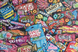
Oh Sugar, Sugar!

Oh Sugar, Sugar!
Nov. 2017- Jan. 2018
Pencil crayon & ink on rag paper
Grade 11 University/ College Visual Arts
This is a drawing that I have created showing many different famous brands of candy as well as chocolate bars all stacked on top of each other; almost in an endless candy mountain. My goal with this piece was to convey how in today's society sugar surrounds us and consumes many peoples lives. In today’s society it seems like people have limited time to make food at home, or simply don’t have the money to buy fresh produce with rising prices. Many people go into their local convenience store and conveniently pick up a ready to eat chocolate bar, candy or even some pre prepared food to get something into their stomach. While these companies are swimming in money, people start to have sugar induced health problems. We all indulge every now and then because yes; it does taste really good.
Besides the social meaning of this piece, there is also a deeper meaning of it for me. Recently I have been trying to find my artistic focus, and I have discovered that I am best at drawing pieces like this that include realistic images of everyones favourite confectionery as well as some of my favourite foods. It makes me really happy that I have found what my focus is as an artist and I hope to start expanding my knowledge of this subject matter. To create this piece in particular I went to my local convenience store to take some reference pictures, and also did some research on google to look for some other types of candy that would look good with the colour pallete. To achieve a realistic look I layered various colours of pencil crayon over each other so that they would perfectly match the wrapper of the real candy.
I have definitely learned a lot from what I have achieved with this piece. I have learned about the importance of subject placement, the rule of thirds, as well as the importance of using contrast. Overall I think that this piece turned out nicely, and is probably one of my favourite pieces that I have done up to date.
Practice Pays Off
 Fried Egg Still Life Early 2017 |  Sour Patch Kids (with a twist) Mid 2017 |  Fuzzy Peaches Mid 2017 |
|---|---|---|
 Oh Sugar, Sugar! Late 2017- Finished early 2018 |  Crushed Coca Cola Can November 2017 |  Swedish Fish Candy Late 2017 |
Waves

Waves
2017
pencil crayon & ink on toned gray paper
Grade 11 University/ College Visual Arts
This is a stylized drawing of a waves crest at nighttime, inspired by my love of the ocean and everything that lies within it. The majority of my artwork is very colourful and conveys the mood of the piece through the colours that are used. By using a pastel colour palette for this piece I was able to achieve the feeling of seeing the ocean during a sunset. Its calming for many people to view the ocean, however for others the ocean represents chaos as it is unpredictable. In my opinion the oceans unpredictability makes it beautiful to view.
To create this drawing I looked at some pictures from my previous travels to achieve an accurate wave drawing. In my opinion I think that this piece is very successful because I used a more stylized approach instead of being detail oriented like work that I usually do. I especially like the use of line, the colour palette, and how the round framing makes this piece unique. Originally I did not think that drawing the wave in a circle would work, however I am glad that I decided to take this approach because the curvature of the wave follows the shape of the circular frame and enhances the sense of a rolling motion.
I think that using a more stylized approach for this piece has expanded my artistic abilities and has taught me that not all of my work needs detail to be good. This piece was definitely a work in progress as far as deciding whether or not to include a sunset in the background and how bold to make it. After drawing the wave I decided to make the sunset very subtle in colour so that the wave would be more prominent. Overall I am very proud of this work, however if I were to do this again I would probably spend more time studying the spray of the wave to make it look more accurate.
The Man In The Moon
 This is the printing plate I made on masonite with cardboard, string, and a penny. The penny ended up being pressed into a print by the press! |  This was one of the first prints I did of this piece. It was fairly successful, however I am not a fan of the colours. |  As you can see I accidentally put too much ink on the plate before rolling it through the press. |
|---|---|---|
 This was my first attempt at printing this plate in black and white, as you can see there was some blue left over from the previous print. I actually like the effect that this created. |  A ghost print of the previous print. I think that this print is successful and unique. |  This is my final print that I chose to mount. I enjoy the warm colours of ink, and the penny which was pressed into the paper. In my opinion the penny makes this piece look complete! |
Mother Nature


Mother Nature
Studio Piece
Acrylic paint, cardstock & paper mache on brown masonite board
Grade 11 University/ College Visual Arts
This painting that I have created is of a woman holding her hands out which are filled with various butterflies. When I was brainstorming for this piece I decided to make the focus about nature, and make the woman resemble a mother nature type figure. I have always had a deep love towards the environment and how we treat our planet. I enjoy studying about our environment, and researching ways about how to make our world a better place. I think that butterflies are beautiful insects and also tell us a lot about how we treat the environment.
To create this work of art I first sketched out the woman’s figure, and then sculpted the 3D hands with paper mache by using my peers hands as a live reference. After the sculpting was complete I went over everything with acrylic paint to achieve the final product. There was lots of trial and error involved during the creation of the hands. Since I used paper mache I ran into the problem of the surface not being smooth enough for real hands. I finally fixed this problem by smoothing it over with a glue mixture.
Personally I would say that there are parts of this piece which are successful and other parts that are not as successful. I like the way that the butterflies provide dimension to the painting, how the different shades of brown add depth to the hair, and the colour pallete of this painting. However next time I would probably go over the skintone with a warm tone glaze to add more definition to the woman all together. In my opinion this piece definitely pushed me out of my ‘comfort zone’ as an artist; acrylic is not my prefered medium but I think that the painting did turn out ok.
 Geometric Butterfly |  Optical Illusion |  Watercolour Jelly Fish |
|---|---|---|
 Cool toned mandala |  Watercolour Lips |  Red lipstick |
 Watercolour Tree frog |  Cool toned mandala |
Look Into My Eyes, What Do You See?


Look into my eyes, What do you see?
Mixed media on paper
Grade 11 University/ College Visual arts
This piece is inspired by how much a person’s eyes show about their character, and their inner feelings. I have always had a fascination with eyes, and I think they are the most unique feature on every person as nobody’s eyes are ever the same as another person's. Even though our eyes do not look the same as each other's, the one thing that all eyes have in common is that they all tell a story.
In this piece there are three single eyes. The top left eye (the green eye) was drawn using prismacolor pencil crayons to achieve a natural look. The eye below it (the black and white eye) was drawn with staedler graphite pencils all which ranged from 2H to 8B. The final eye on the right was painted with a watercolour base and the black details were done with pebeo acrylic paint.
I really like how this work looks and I also like the emotions I was able to convey through it. While I was creating this piece I changed up the layout of it multiple times. At first I only wanted the graphite eye to have a tear running off of it because darker colours are often associated with sadness. However due to some empty space on the right, I decided to add tears running down it as well from the watercolour eye. I feel like this was ultimately the best decision for the painting because the tears make this piece flow better as a whole, and help balance the two eyes on the left. I think that if I were to do this another time I might add a fourth eye; possibly done with chalk pastels. Overall I really like how this piece turned out and it is one of my favourite pieces that I have done.

Best Friends


Best Friends
Watercolour paints on watercolour paper
Grade 11 University/ College Visual Arts
This is one of my favourite pieces and is part of a series of giraffe watercolour paintings that I am currently working on. I have called this one Bestfriends, as it represents the bond between these two animals. Personally I think that having really good friends that you share everything with makes you happier. When you find “your” people you become much happier. Having really good friends benefit your outlook on life, decrease stress levels, and give you a support system when life becomes tough. Personally I am very happy to have a wonderful group of friends that I have met in high school and have grown closer to.
I have always thought that giraffes are beautiful animals, and giraffes also represent success in my art career. Last year I painted the giraffe on the left. It gained popularity within the school which was totally unexpected to me. I decided to put it into the Blyth festival of Arts last year and won 1st place as well as a cash prize, I was beyond excited to receive this news. Since lots of people enjoyed the last giraffe I painted I have decided to create a series of these creatures.
With this giraffe painting I decided to take more of a cartoon like approach and I made them look more playful. To me these giraffes represent happiness, and joy. I created this painting in two sections: first the two heads, then the bodies, so that the colours wouldn’t transfer. If I were to do this painting again I would probably add more detail in the faces and use more of the watercolour painting techniques that I used in the previous giraffe painting. However, I do like how this painting turned out and do think that it is a beautiful piece.
By: Kirsten McAuley


